
I know that a lot of people are really frustrated with the statistics that we’ve seen coming out of the COVID-19 crisis. Some people flat out think they’re bullshit and feel that they’re too flawed to be worth paying any attention to.
Being a guy whose career involves understanding data … I don’t agree.
I wish the data was better, but at least it’s something and when we’re trying to measure the impact of a worldwide phenomenon, something is better than nothing.
Sure, in a perfect world, testing would be readily available to anyone who showed the slightest symptoms, and hospitals would all follow the exact same procedures for dealing with the virus, and people would go to the doctor when they’re supposed to, and health departments wouldn’t sometimes fudge their numbers, and so on and so forth!
Of course, in a perfect world one might argue that we wouldn’t be dealing with a global pandemic in the first place, so there’s that…
So the data is what it is – we just have to quantify it and keep those exceptions in mind, which I get can be frustrating when we’re being told not to leave the house and we feel like we’re making all of these sacrifices by maintaining our distance and the total # of deaths seem small compared to things like the flu and other common causes.
Regardless, what I’ve found is most insightful for me over the last week is to really only focus on a couple of metrics:
- Daily New Cases, specifically in the United States <— this is my main focus
- Total # of Deaths, both in the US and here in Florida <— this is my reminder that we’re talking about human lives at stake
The data I look at each day is found here – https://www.worldometers.info/coronavirus/country/us/
In particular, I look at this chart to see how the rate of the spread is growing here in our country…
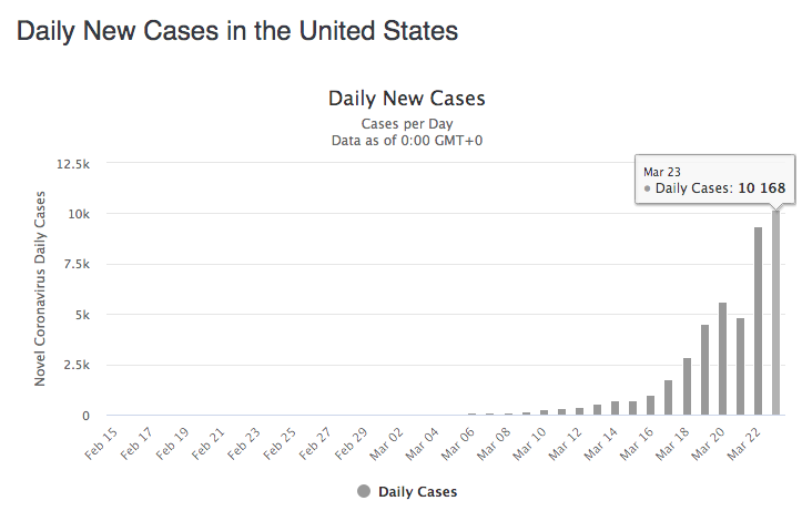
Now for clarity, yes – the numbers are growing because we’re testing more people than we were two weeks ago. That’s ok! What we’re really looking for is merely the curve to help judge when the spread has reached its maximum growth rate to ultimately help indicate when things might start getting back to normal.
Compare our graph above to China’s latest…

That’s what we’re waiting for ours to look like – the same gradual growth that we’re seeing now as the Chinese came to terms with the virus, a few anomalies along the way, followed by a gradual decrease to where they’re seeing a fraction of the new cases each day and it’s safe to assume that they’re volumes that their healthcare system can once again support.
I mean, I guess there are some people who are just never going to trust the data no matter what it says, and there’s so much commentary and anecdotal evidence and sheer panic going around that maybe it’s easy for some to cast doubt in what they’re seeing on the page.
I personally think it’s safe to look at these numbers as a barometer – we’re not solely relying on them to make major, guiding decisions in our lives during this crisis. They’re simply a guide to help us understand how things are going and if the shore is in sight on the other side of this thing yet.
Unfortunately, I think we’ve still got a ways to go, which is a whole nother ball of problems in the chaos that it creates as we push through this. I know that we’ll get there eventually, but there will definitely be casualties along the way – literally, economically, you name it.
Still, it doesn’t hurt to carry a light as we make our way through this.
That’s all the data serves as – no more, no less.